Creative musings about creative stuff by a creative cartoonist.
-
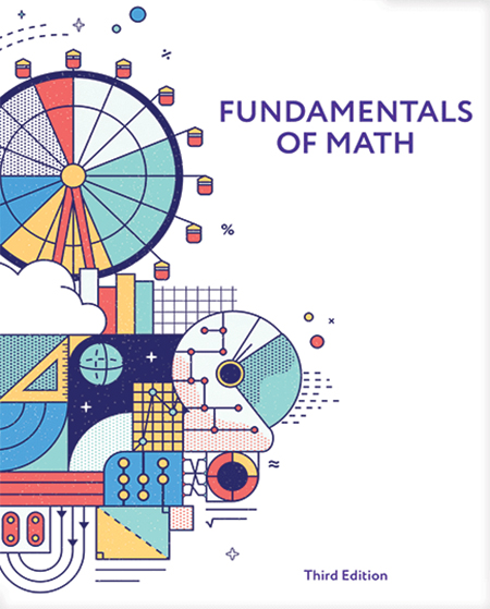
Fundamentals of Math
As the school year begins to wind down, perhaps now is a good time to mention my recent foray into the world of academia that will affect kids beginning in the 2022-23 school year. Just as things were getting locked down back in 2020 due to coronavirus, I was in talks about a project with…
-
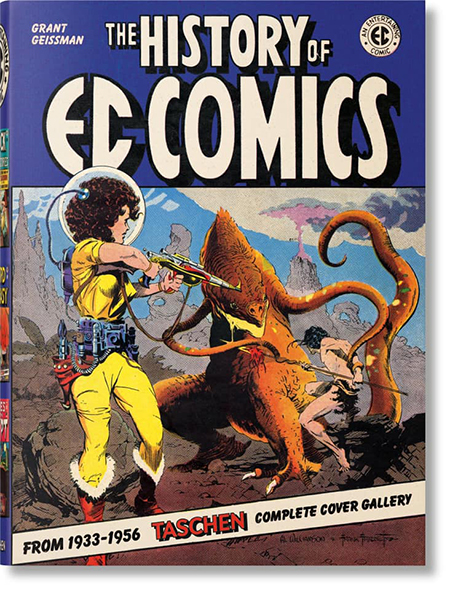
History of EC Comics
You know, I’ve gotten all caught up in sharing sketchbook drawings here, that I neglected to share with you some real work that I did that was published in 2020. Let’s remedy that, shall we? So, here’s the set-up… my friend, Grant Geissman, wrote a terrific (and quite gigantic) book about the history of EC…
-
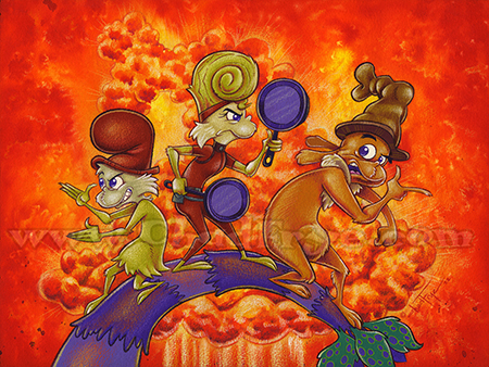
Sammy’s Angels
In celebration of season 2 of Green Eggs and Ham being released on Netflix today, I created this new piece I call Sammy’s Angels featuring Sam I Am, his superspy mother Pam I Am, and Guy Am I. The show is traditional (hand drawn) animation, so why not a hand drawn illustration? This was made…
-
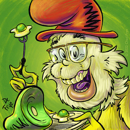
Sam I Am?
Any of you Netflix subscribers out there excited about this Friday? According to Netflix’s website, Season 2 of Green Eggs and Ham is still supposed to be coming out on April 8! Since I don’t personally have Netflix, I’ll just have to wait to hear the sound of all the Whos down in Whoville singing…
-
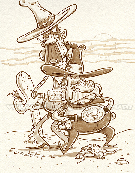
Ten-Gallons
They wore ten-gallon hats with ten gallons of attitude. Inked in my sketchbook, toned in Photoshop, attitude from a life of hard-knocks.
-
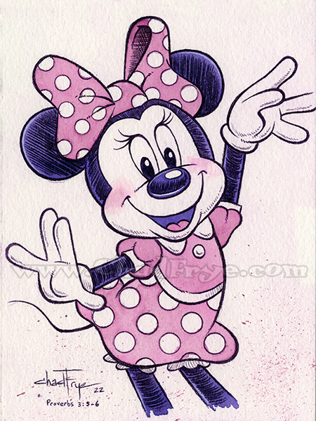
Pretty In Pink
Hoo boy. I’ve been pretty busy of late finishing up a big book project I’ve been on for the past nine months. Happy to say that the final touches were completed yesterday! There’s always a huge sense of accomplishment when you do that final paint stroke on something you’ve put so much time into. I…
-
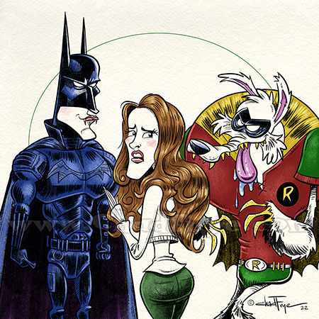
The Batlight Saga
I hear there’s a new Batman movie out now starring Robert Pattinson. I didn’t see it, but I figure this is probably what it was like.
Animals (373) Art: Animation (74) Art: Colored Pencil (190) Art: Drawings (393) Art: Inking (334) Art: Painting (208) Art: Photography (21) Art: Photoshop (245) Art: Preliminary Sketches (41) Art: Storyboards (3) Art: Typography (6) Art: Watercolor (211) Bible Art (22) Caricature (138) Cartoons (113) Chad's Editorials (37) Chad About Town (75) Character Designs (582) Coloring Book art (12) Comic Books (38) Contests (16) Development Art (33) Disney (102) Drawn & Quoted (36) Film Music (18) Flat File Archives (14) For Sale (12) Frankenstein (29) Illustrations (397) Life Drawings (54) Miscellaneous (12) Monsters (283) Publishing (1) Random Doodles (337) Self Portrait (28) Sketchbook (396) Step-By-Step (23) TIM the Movie (16) Videos (27) Zhu Zhu Pets (14)